Some rough initial concept sketches getting ideas onto paper.I decided to focus on a tea leaf or seed, as Teza pride themselves on being home brewed and organic. Also, through my brand analysis research I noted that Tezas competitors predominantly us fruit imagery, so this will provide a point of difference.
Sunday, 31 August 2014
Thursday, 28 August 2014
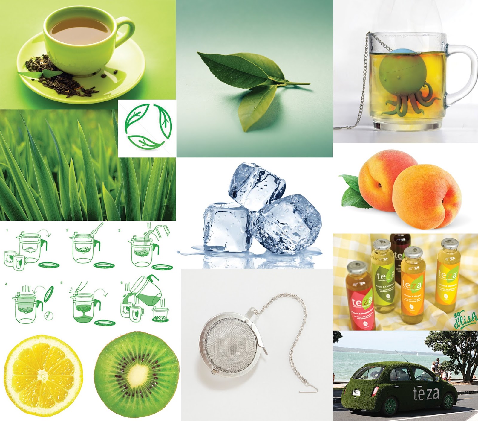
Moodboard
I gathered some visual research of existing imagery that I could potentially use as a basis for my character. Following Tezas brand values, I feel what sets them apart from their competitors is their organic image and environmentally friendly process. Tea leaves are their current representative image, which I could work from as that also sets them apart from their competitors, who predominantly use fruits.
Wednesday, 27 August 2014
Competing Brands
It seems that Teza competes with two other major iced tea brands, often stocked in stores throughout New Zealand:
Lipton
Though Lipton also doesn't currently have a character mascot, their advertisements often include hot celebrities and energetic individuals. Their whole brand image and slogans revolve around feeling 'refreshed' and 'drinking positive'. They often place images of fruits and ice cubes on their packaging and advertisements to reinforce this message.
Fuze
Fuze is another juice/ iced tea brand, that competes more closely with Teza in price and affordability. Although they don't have a character mascot, they have a series of images displayed on their packaging and advertisements of hybrid fruits. This reinforces their slogan of 'unreal refreshment', thriving themselves on their unique combinations of fruit flavours.
Fuze is another juice/ iced tea brand, that competes more closely with Teza in price and affordability. Although they don't have a character mascot, they have a series of images displayed on their packaging and advertisements of hybrid fruits. This reinforces their slogan of 'unreal refreshment', thriving themselves on their unique combinations of fruit flavours.
Monday, 25 August 2014
Visiting the store
I decided to buy Teza first hand myself, to get an idea of the experience involved and see the packaging design close up. I found that Tezas simplistic design is what makes it stand out from other juices surrounding it in stores. It appears as a fancier and healthier iced tea through its unique glass bottle packaging, and the flat design helps emphasize that its organic and stripped of any artificial additives.
Sunday, 24 August 2014
Brand Values
After continuing research, I found a number of values upon which they pride and distinguish themselves on. They are as follows:
- 30% less sugar than soft drinks or juices
- Brewed from real leaf tea
- Organic
- No artificial additives
- Recyclable bottles and caps
- Natural flavors
- Grass marketing cars
Saturday, 23 August 2014
Brand Research - Teza Iced Tea
Teza are a New Zealand based beverage company, who specialize in ice teas. Teza drinks were launched in 2007, and is owned and run by husband and wife duo Joe Gehrke and Daphne Raj. The Teza ice tea range is available in cafes and selected food stores for RRP of $3.95.
Teza is not an abbreviation, but often a girls name or surname with the meaning 'to reap what you harvest'.
Teza is not an abbreviation, but often a girls name or surname with the meaning 'to reap what you harvest'.
Bottle Designs
Marketing Car
Brand Image
Saturday, 16 August 2014
Rationale
The figurative artist that heavily inspired this piece was Javier Pacheco. Pacheco is an Italian artist, who takes strong influence from Japanese pop culture. I myself am also enamoured of Japanese pop culture, and my composition and chosen elements reflect this. As stated in my biography, I have always been a fan of video games and been more inclined towards cuter characters. I placed a number of these throughout my composition to enhance this. Whilst reflecting, I also realised that a lot of my hobbies growing up were often quite unusual and surprising to others. So I created an eclectic and busy composition to reflect this, and visually show my unusual personality traits. Overall, I feel my portrait is compelling, exciteful and is identifiable as me.
Thursday, 14 August 2014
Final Development
After receiving feedback, I have continued to push facial and shirt details. I am currently in the process of adding depth to the hair by pushing darker tones.
Wednesday, 13 August 2014
Final Development
Monday, 11 August 2014
Final Development - Style Change
After feedback in class today, I have decided to challenge myself further by digitally painting my portrait in a more figurative and blended style, direct from photo reference. I will attempt to paint the hair and characters in a similar way, but perhaps leave the background and patterns contrasting this as Javier Pacheco always does.
Saturday, 9 August 2014
Final Development
Continuing to add extra elements such as the characters, patterns and background in a similar style and colour scheme to Javier Pacheco.
Thursday, 7 August 2014
Wednesday, 6 August 2014
Tuesday, 5 August 2014
Saturday, 2 August 2014
Friday, 1 August 2014
Photo References
I took a few photos as reference for when I sketch up my portrait. These two are my favourite positions, and I think I can exploit them nicely compositionally.
Hair References:
Subscribe to:
Comments (Atom)


